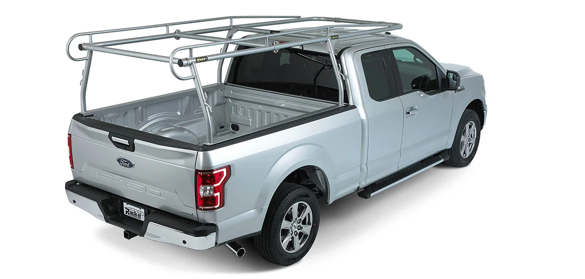
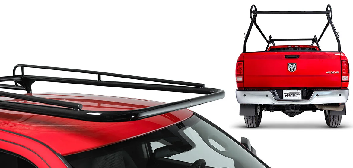
Industry: Automotive Rack Manufacturing What We Did: Website Design / Website Development / Photography / Brand Identity
CHALLENGE How do you revamp a powerhouse brand in the world of commercial truck racks—one that’s known for building the toughest, most reliable systems on the road? How do you elevate their image to match the strength and durability of their products?
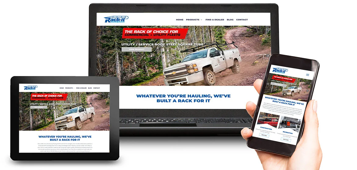
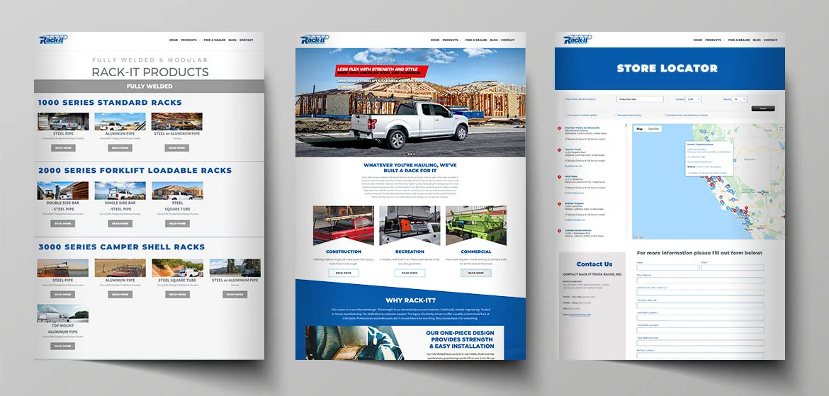
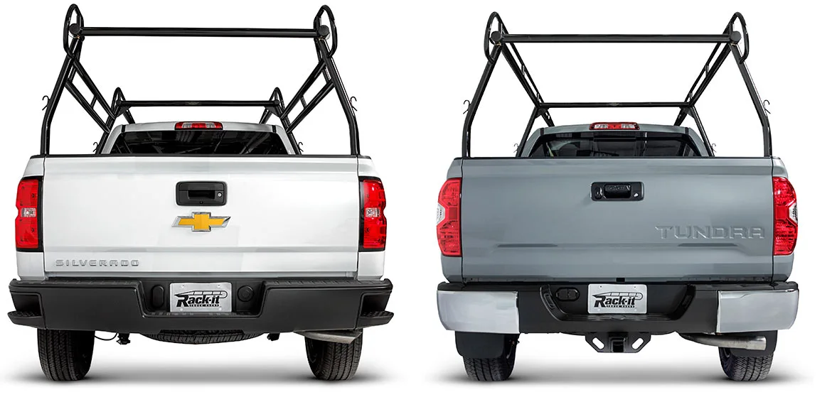
SOLUTION You go bold, you go rugged, and you make every detail count. At Dogs of Design, we reimagined Rack-it’s entire brand presence, starting with a logo that speaks to their unwavering toughness. We took inspiration from their signature roof rack product, fusing it seamlessly into the design to amplify brand recognition. With strong, bold typography and a dynamic color palette, we captured the raw essence of what Rack-it stands for—strength, adventure, and reliability.
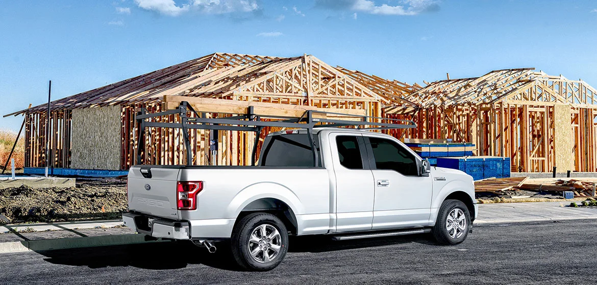
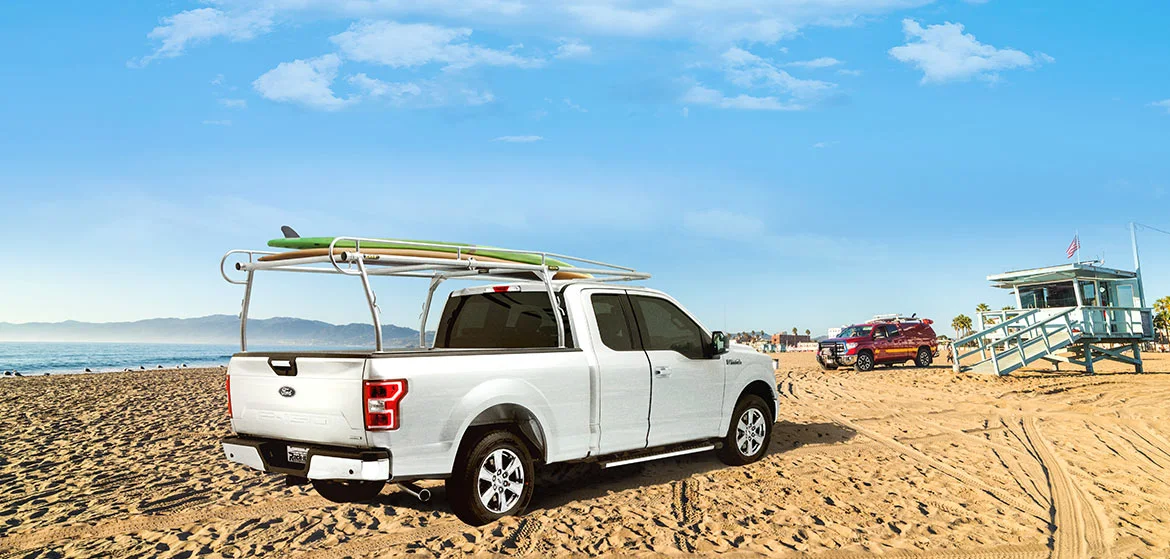
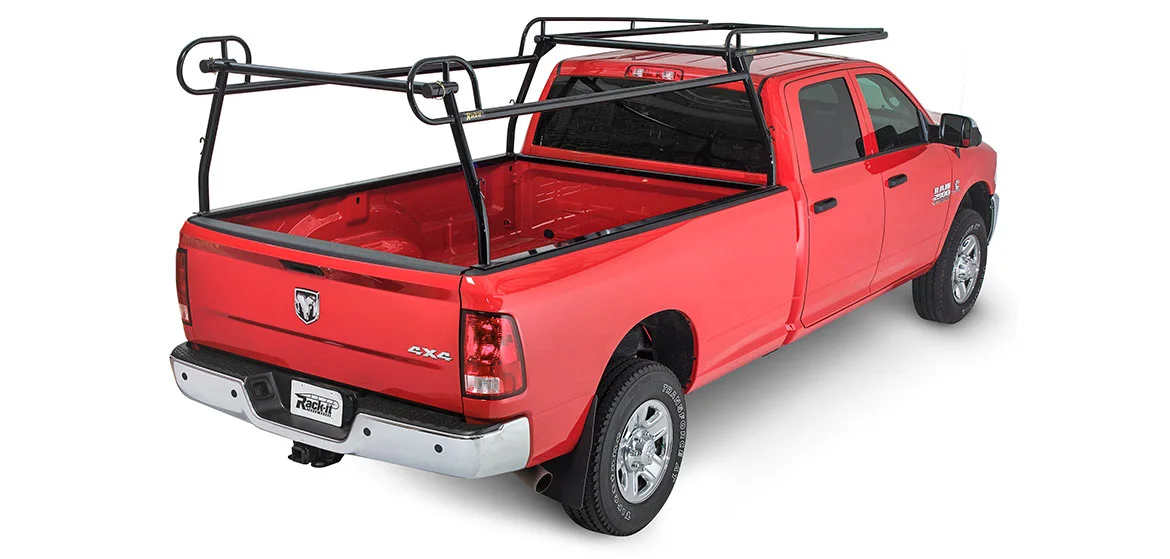
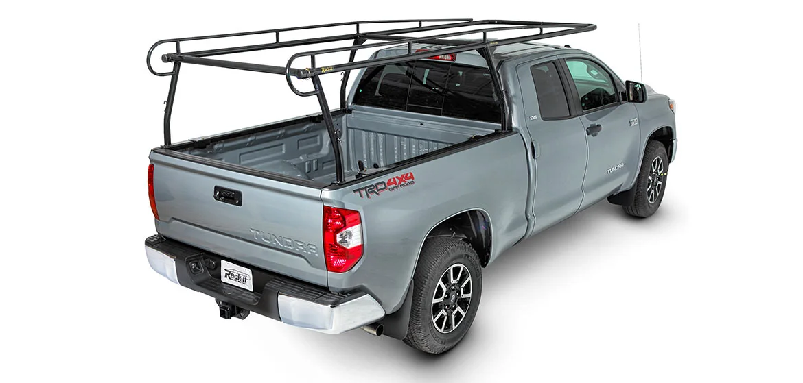
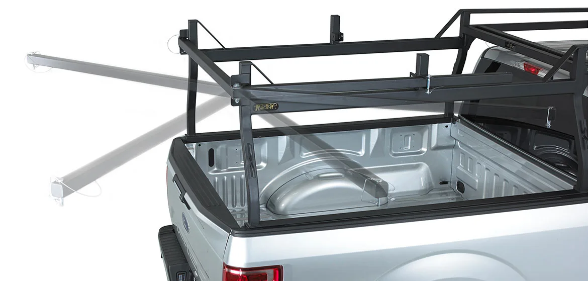
The website mirrors this spirit, combining sleek, intuitive navigation with striking visuals that showcase the durability and versatility of their truck racks. To bring it all together, we shot the products in action, showing off their ruggedness in real-world settings. From the logo to the site to the photography, every piece of Rack-it’s new identity communicates exactly who they are: the go-to brand for commercial truck racks that go the distance.