Industry: Mezcal Distributor What We Did: Brand Identity / Packaging
Del Pibe Mezcal Label and Logo Design
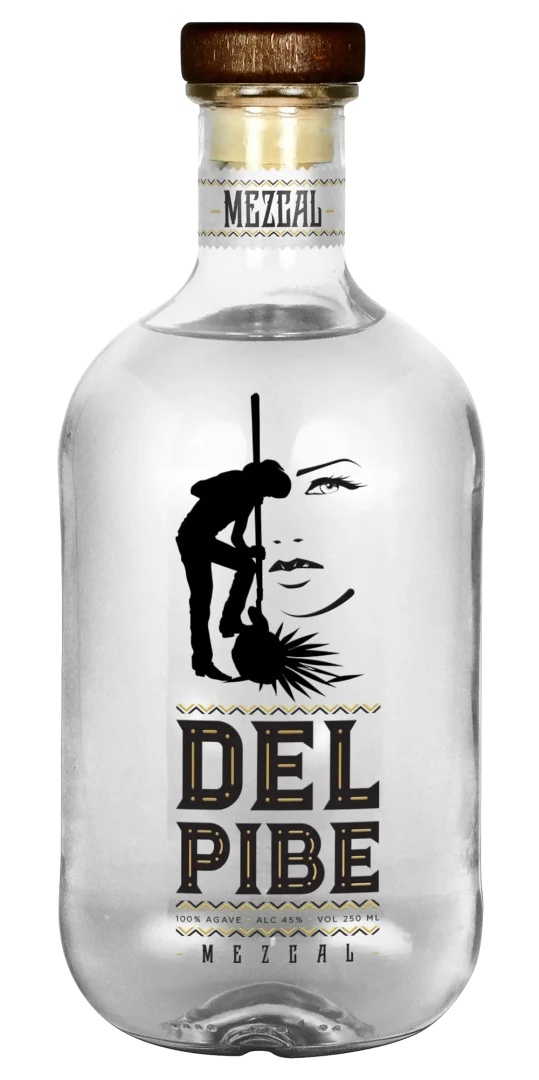
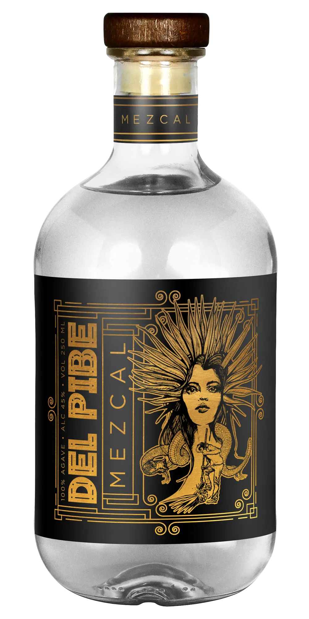
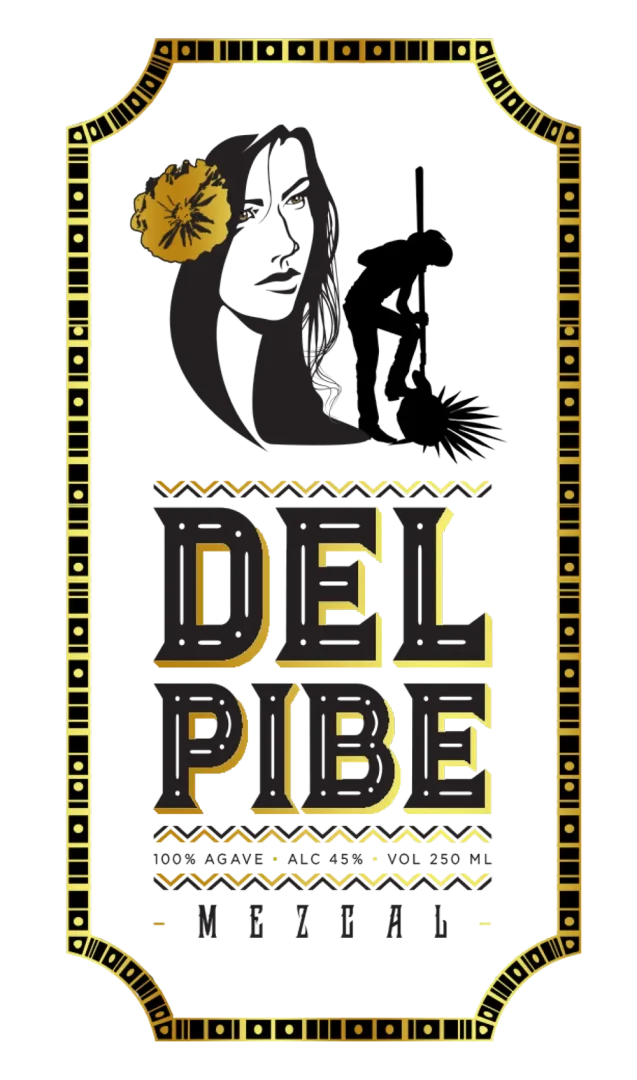
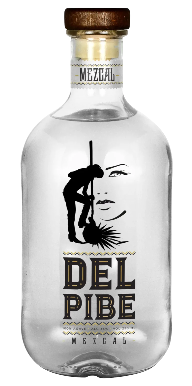
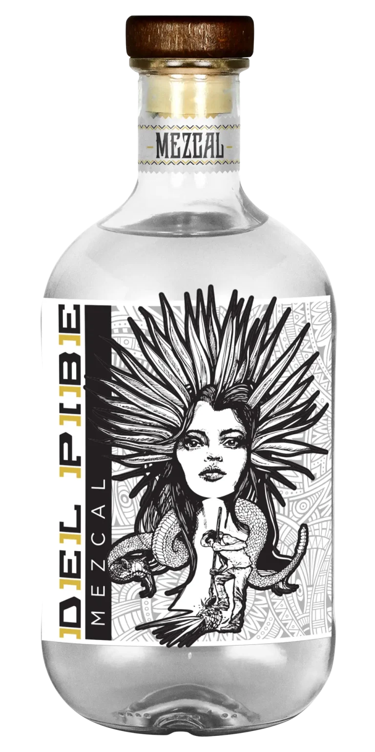
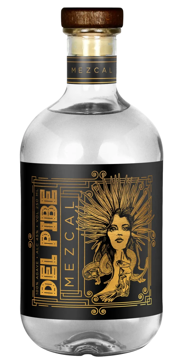
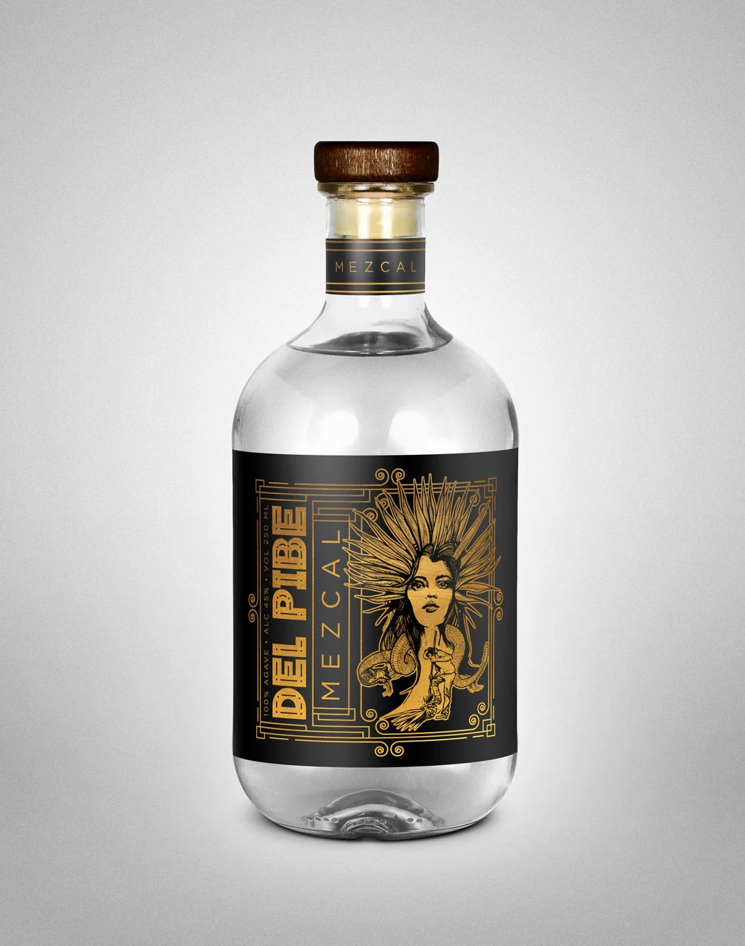
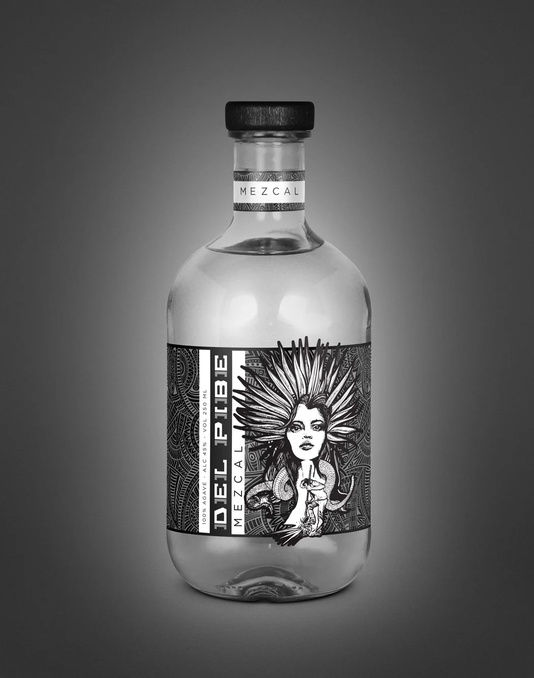
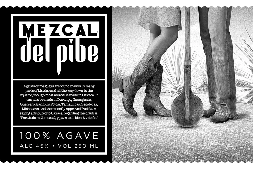
Del Pibe Mezcal is a brand that exudes tradition, craftsmanship, and authenticity. Mezcal is not just any spirit; it represents the heritage of Oaxaca, Mexico, and captures the soul of the agave plant. With the rise of premium artisanal spirits, it has become essential for brands to stand out, not only through their product but also through their label and logo design. This is where we stepped in, crafting a label and logo for Del Pibe Mezcal that speaks volumes about the brand’s identity. The design captures both the heritage of mezcal-making and the bold, modern energy that defines Del Pibe.
Tradition and Modernity Combined
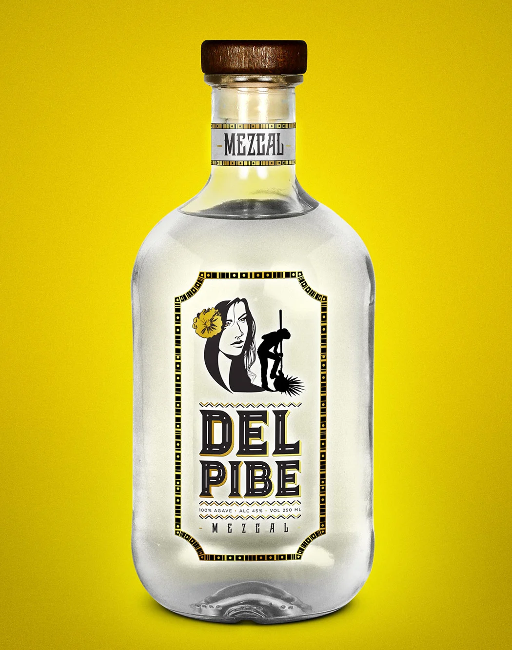
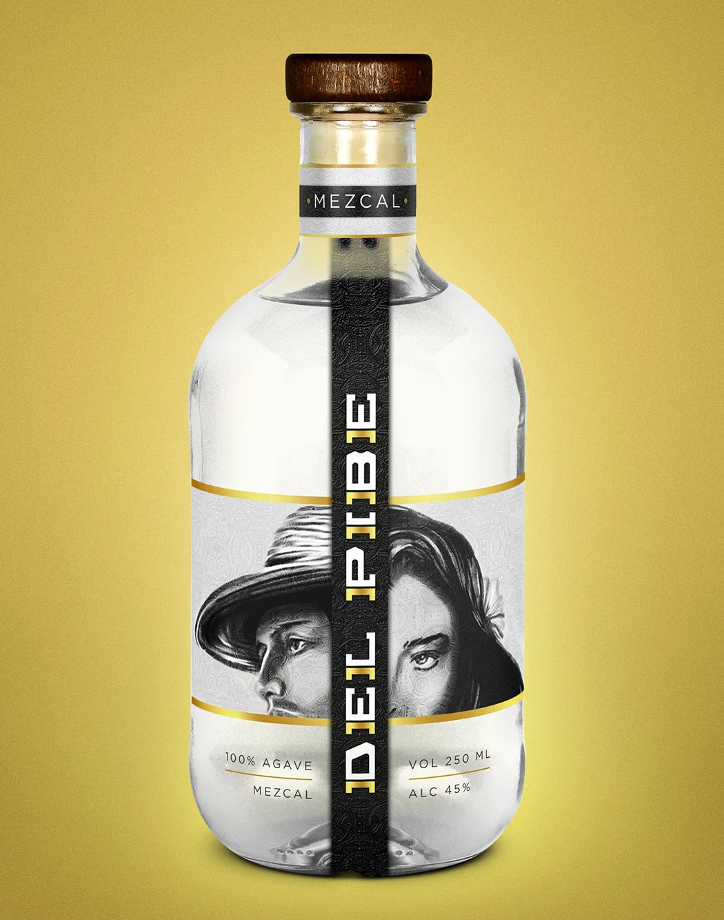
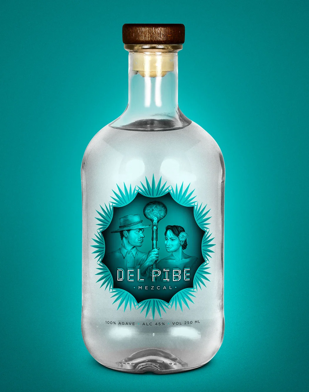
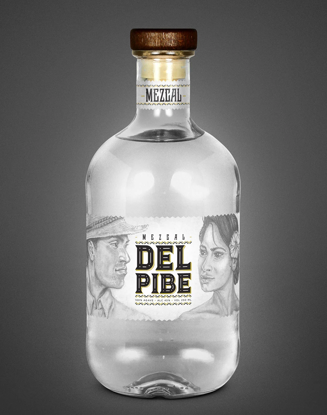
The Del Pibe Mezcal label blends Oaxacan tradition with a sleek, modern design, creating a look that appeals to both heritage lovers and contemporary drinkers.
Bold Logo for Instant Recognition
Del Pibe Mezcal’s bold, unique logo stands out with strong typography and traditional symbols, ensuring instant brand recognition.
Rich Color Palette Inspired by Oaxaca
The label's warm, earthy tones and vibrant accents reflect the Oaxacan landscape and the agave plant, enhancing the brand’s authentic connection to its roots.
Typography:
Tradition Meets Modernity
The typography used in the Del Pibe Mezcal label is a seamless blend of traditional and modern design elements. The serif font chosen reflects the brand’s respect for tradition, while the sleek, contemporary lines add a modern edge. This combination of old and new is a recurring theme in the design, emphasizing that Del Pibe Mezcal honors its heritage while embracing the present.
Typography is a powerful design element that often goes unnoticed but has a profound impact on how consumers perceive a brand. By blending traditional and modern fonts, We ensured that the Del Pibe Mezcal label would appeal to a broad audience, from connoisseurs of artisanal spirits to younger, adventurous consumers.
Choosing the Right Colors
for the Mezcal Brand
Color plays a significant role in brand recognition, and the color scheme chosen for Del Pibe Mezcal’s label and logo is both striking and symbolic. The warm, earthy tones of the label echo the Oaxacan landscape, while the vibrant accents highlight the lively spirit of the brand.
We carefully selected a palette of golds and browns, symbolizing the agave plant and the earth from which it grows. These colors not only make the bottle stand out on shelves but also create an emotional connection with the product’s origin.
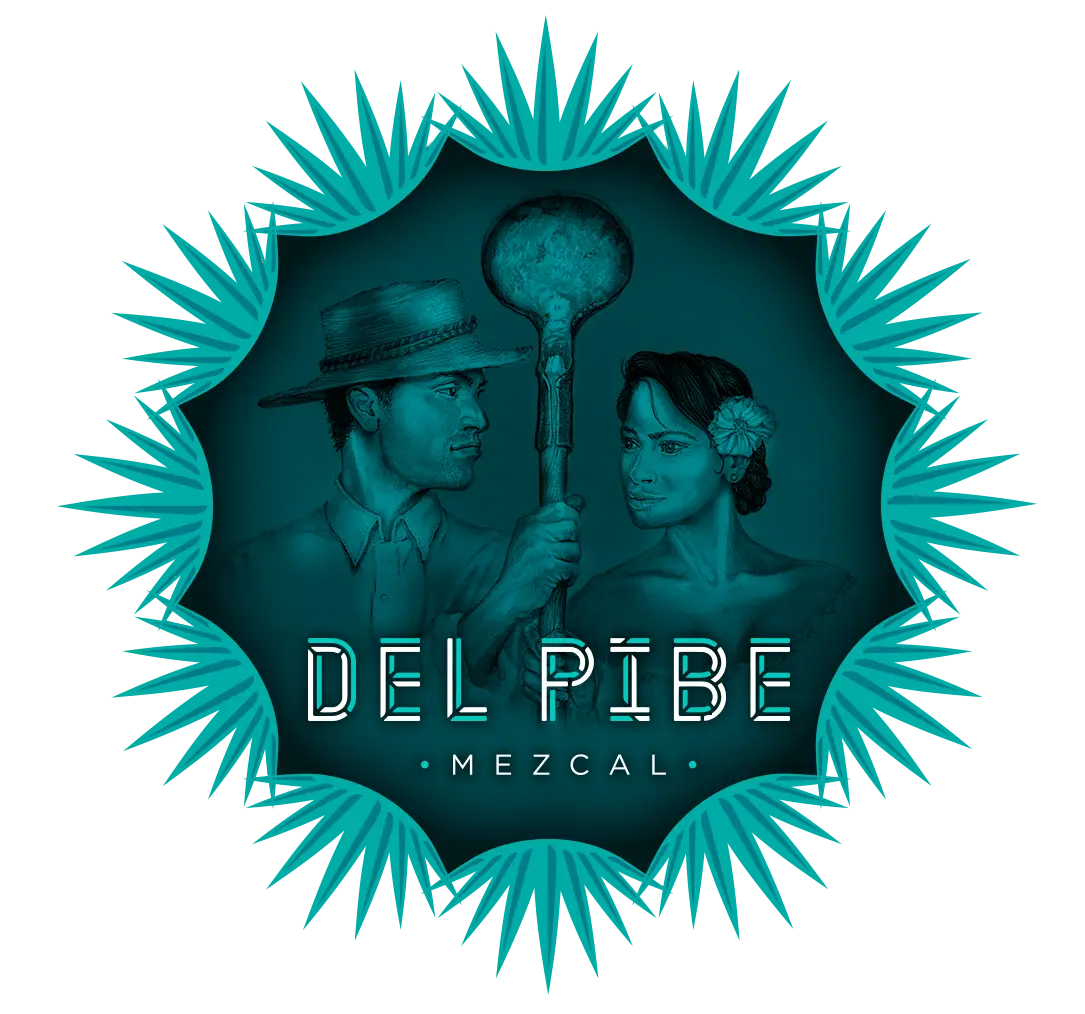
A brand’s logo is its visual signature. It needs to be instantly recognizable, adaptable, and reflective of the brand’s core values. For Del Pibe Mezcal, we created a bold and iconic logo that incorporates a minimalist yet impactful style. The logo is inspired by traditional Oaxacan symbols but simplified for modern appeal. The result is a logo that is as timeless as it is contemporary, perfectly balancing the old with the new.
The use of strong, bold typography in the logo ensures that the brand name is the focal point, while subtle design elements provide a sense of sophistication. The logo can be easily applied across various mediums, from bottles to packaging, ensuring consistent brand identity.
Tactile Design Elements
for a Premium Feel
When designing a label for a premium product like mezcal, the tactile experience is just as important as the visual one.
We incorporated textured elements into the Del Pibe Mezcal label to enhance the consumer’s sensory experience. The use of embossed details and foil accents gives the label a luxurious, high-quality feel, making it more than just a piece of paper—it becomes a part of the overall mezcal-drinking experience.
The label’s textured elements invite consumers to engage with the bottle in a more intimate way, reinforcing the perception of mezcal as an artisanal, handcrafted spirit. This attention to detail helps Del Pibe Mezcal stand out in the crowded marketplace of premium spirits.
Six Initial Design Concepts
Reflecting Oaxaca’s Essence
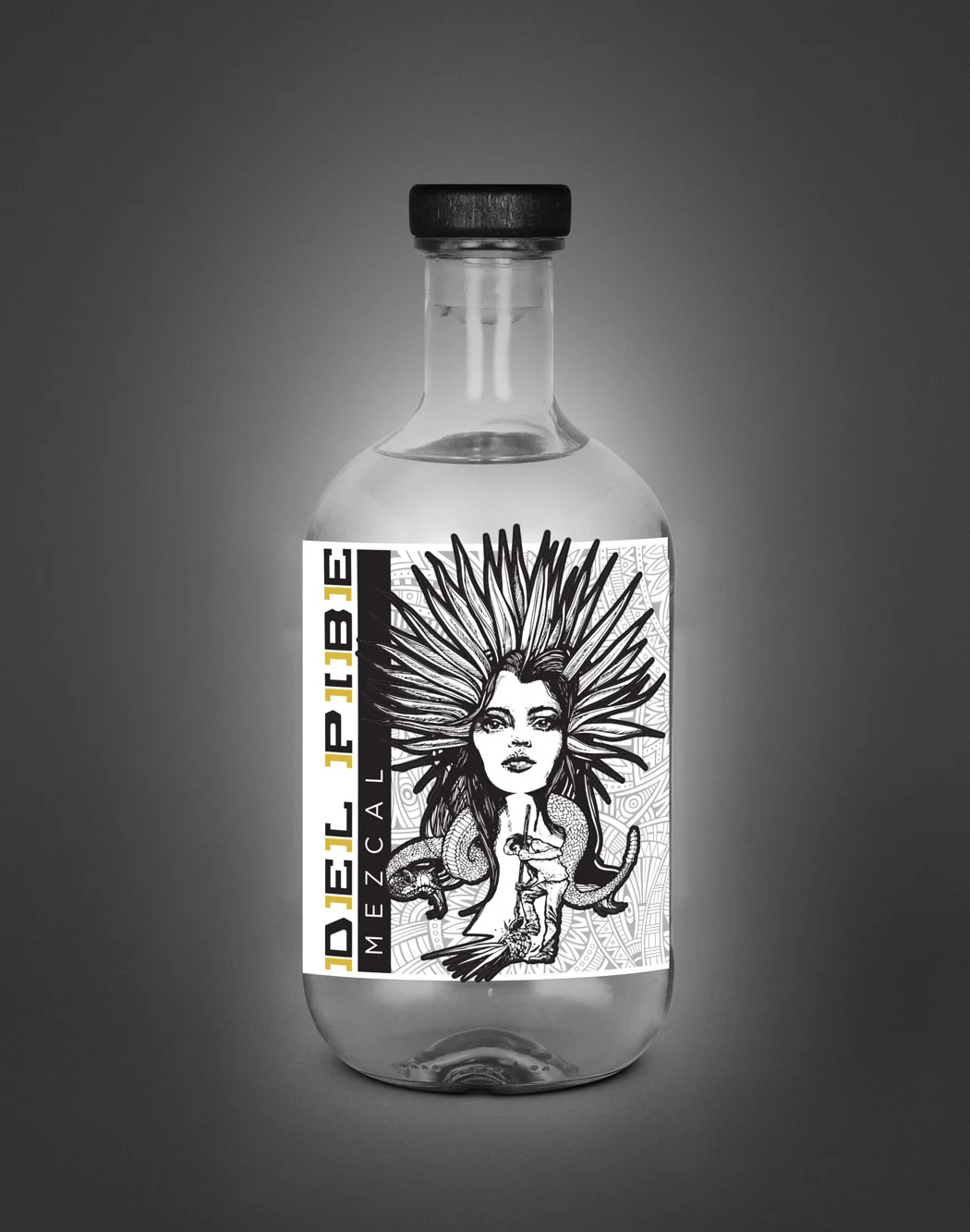
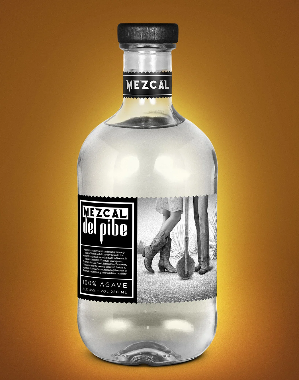
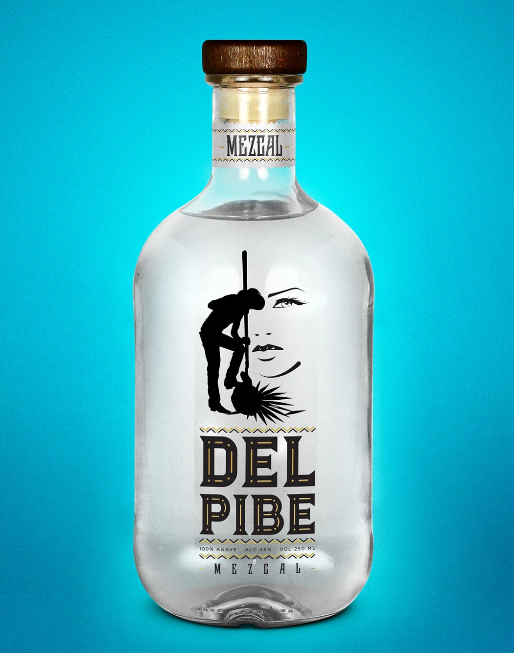
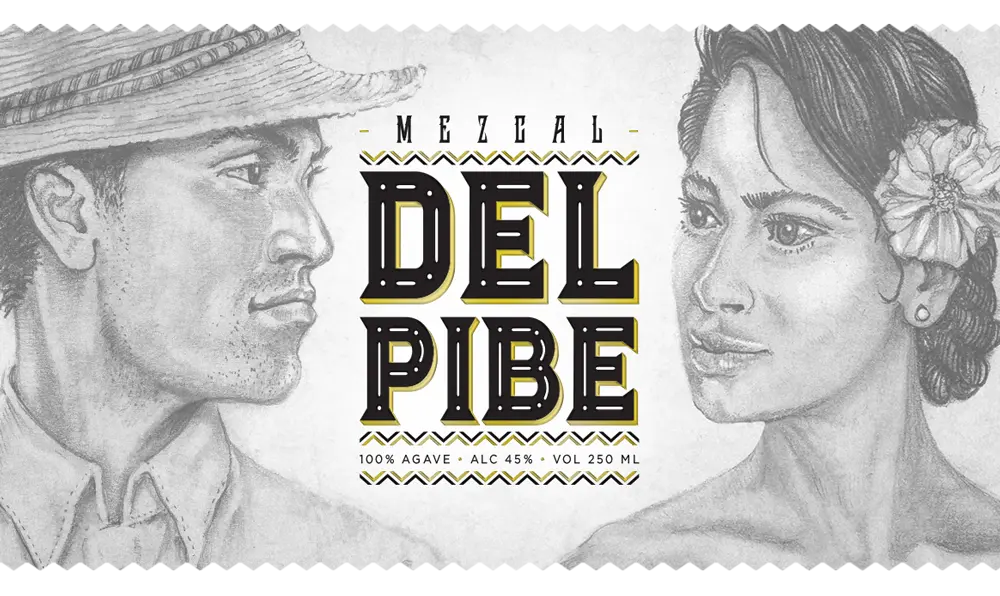
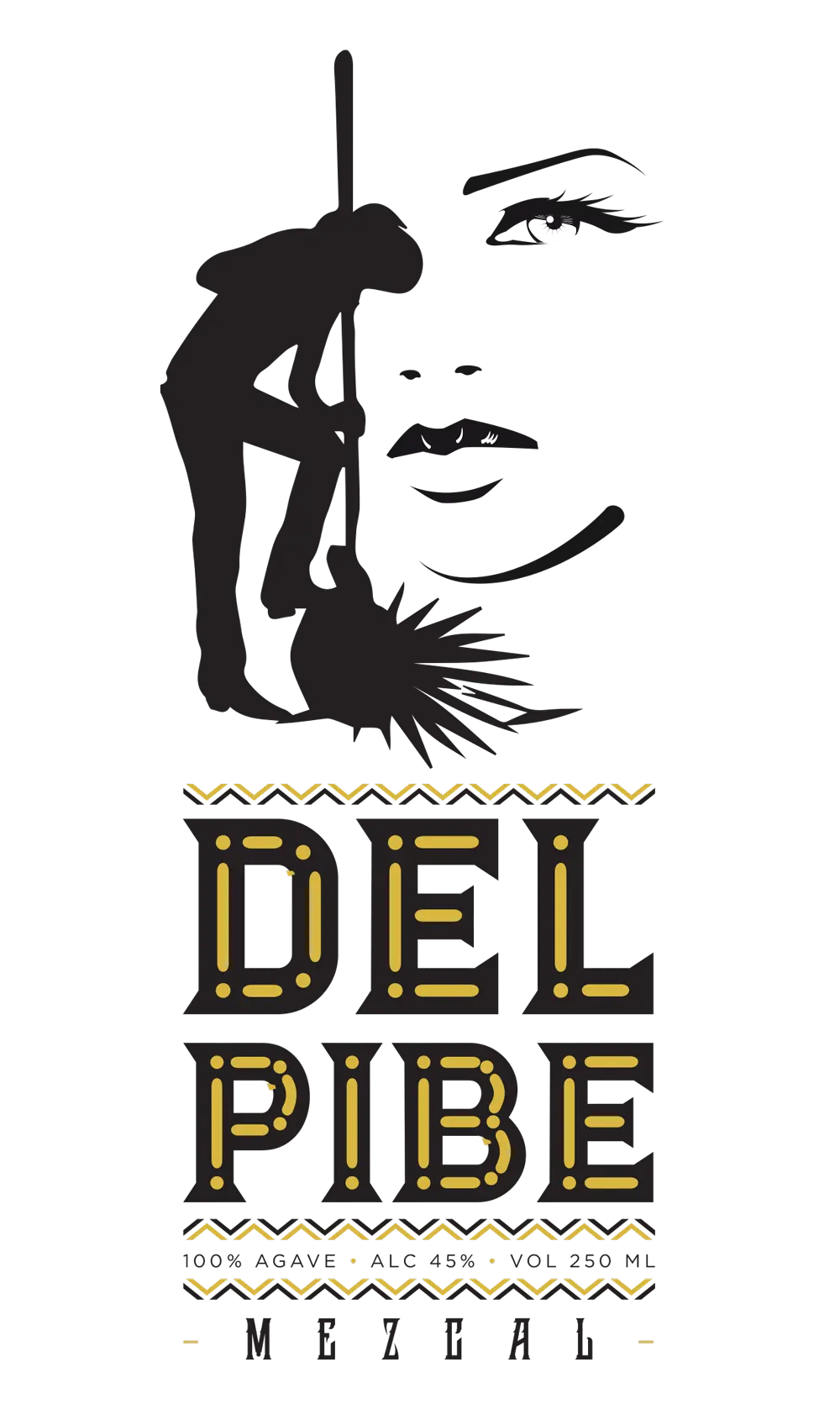
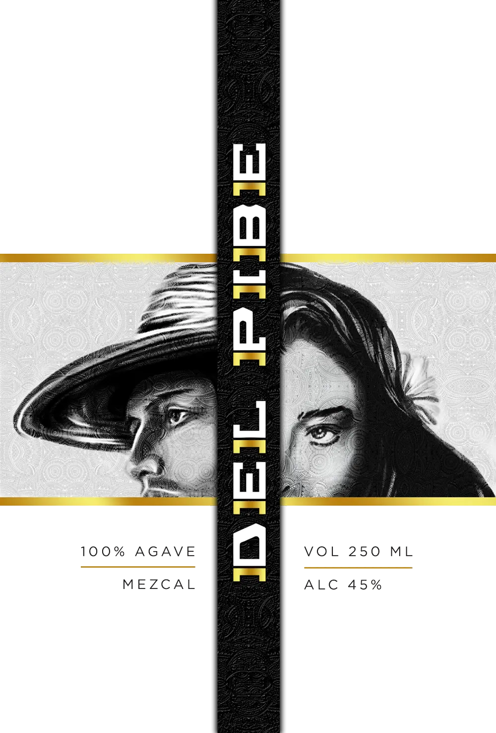
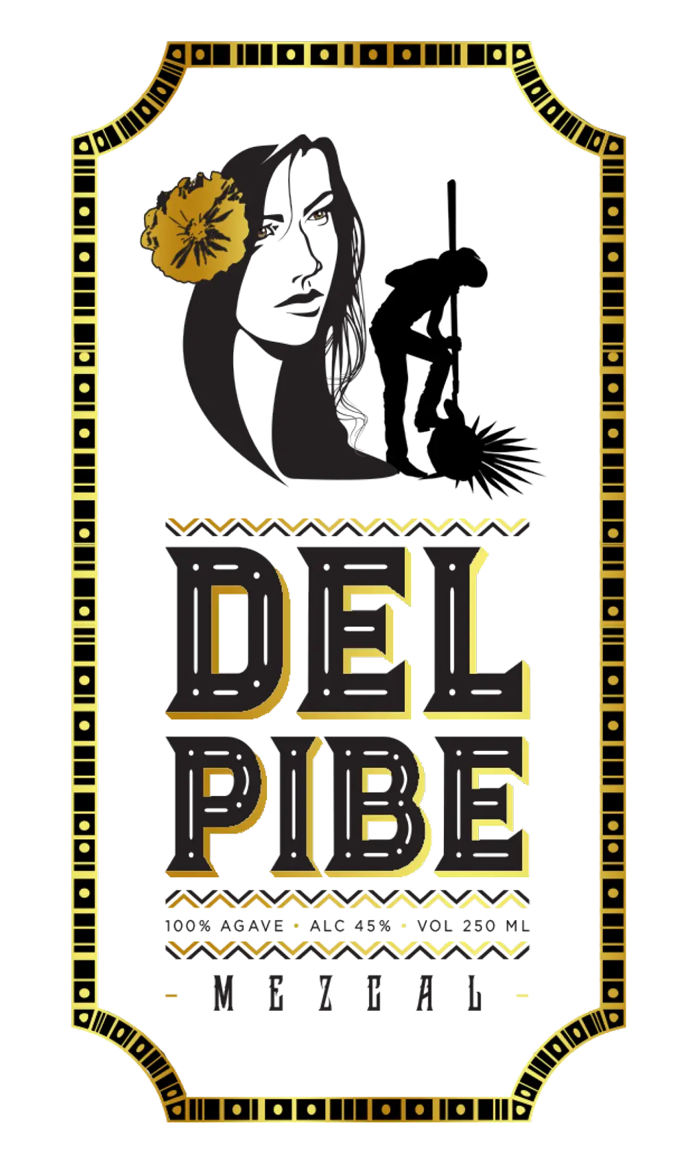
The creative process for Del Pibe Mezcal began with six unique design concepts, each offering a distinct take on the brand’s identity. The concepts featured striking imagery, including a woman’s face, an agave farmer, and beautiful Oaxacan men and women, all symbolizing the region’s cultural richness. Complemented by a variety of stylish fonts, these designs sought to blend tradition with modernity, capturing the spirit of Oaxaca in every detail.
Label Art Showcasing
Six Distinct Designs
From detailed portraits of a woman’s face and an agave farmer to elegant depictions of Oaxacan men and women, the artwork brought the mezcal’s story to life. Each label was carefully crafted with unique, stylish fonts and vibrant visuals, reflecting both the heritage and the modern appeal of the brand.


